Skip to content Advanced Slider Control Documentation
Circular Slider

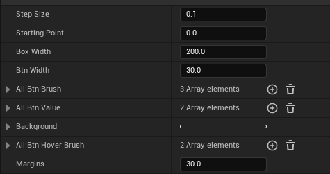
- StepSize: The step size of the slider, which controls the distance the slider moves each time.
- Starting Point: The initial position of the slider (default is at the bottom).
- BoxWidth: The diameter of the slider container.
- BtnWidth: The size of the sliding button.
- AllBtnBrush: The brush for the buttons (multiple brushes can be set, and the number of brushes determines the number and style of buttons).
- AllBtnValue: The current values of all buttons (range from 0 to 1, default is 0).
- Background: The background style of the slider container.
- AllBtnHoverBrush: The brush style for the button when hovered (if not set, the default brush is used).
- Margins: Margins
Rectangular Slider

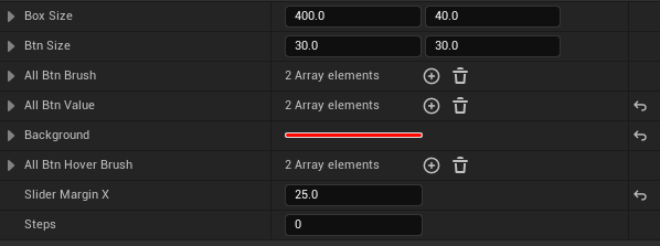
- BoxSize: The size of the slider container.
- BtnSize: The size of the sliding button.
- AllBtnBrush: The brush for the buttons (multiple brushes can be set, and the number of brushes determines the number and style of buttons).
- AllBtnValue: The current values of all buttons (range from 0 to 1, default is 0).
- Background: The background style of the slider container.
- AllBtnHoverBrush: The brush style for the button when hovered (if not set, the default brush is used).
- SliderMarginX: The margin on both sides of the slider, used to control the overflow part of the slider (default is no overflow).
- Steps: The total number of steps for the slider (for example, setting to 5 allows the slider to move 5 times from start to end).


